 There are a number of issues with this design - the color scheme is harsh, the spacing inside that yellow text box is odd, and the text at the bottom is difficult to read on a busy background, despite the inclusion of an outline on the text and copious drop shadows everywhere. I address all these concerns in the redesign, but for this post I'm going to focus on those drop shadows. I've been doing print design long enough to remember the days when there was some work involved to add a drop shadow to an element. One of the nice things about modern design software is how easy it is to apply effects like drop shadows on the fly. But to paraphrase Jurassic Park, novice designers may be so infatuated with what they can do that they don't think about or learn what they should do. Let's start from the top of the design and look at the three drop shadows applied.
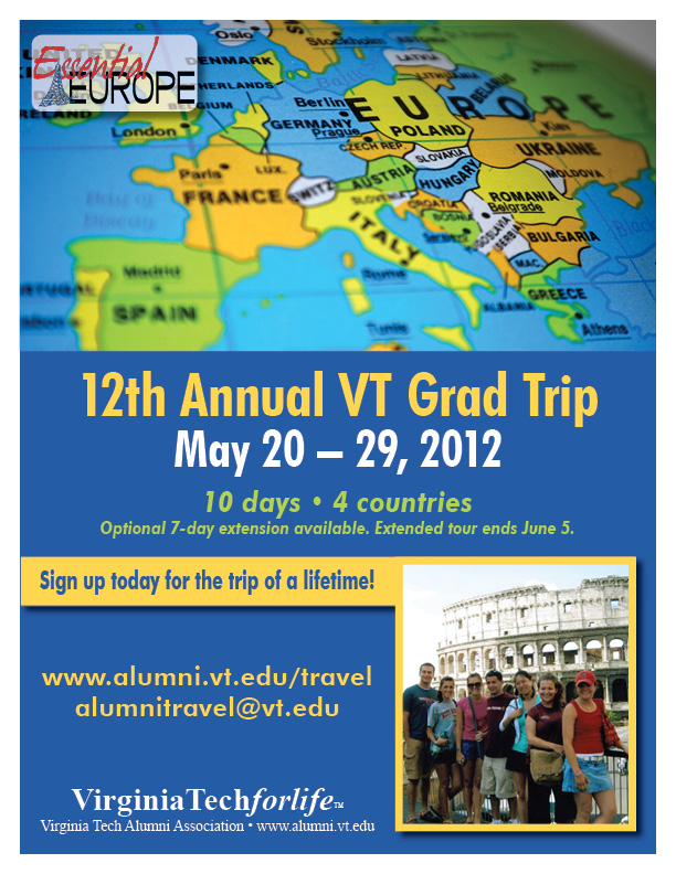 There's now only a drop shadow on the top left logo so it stands out better from the busy background below it, and a drop shadow on the text box and image to give a little depth. Spacing and font weights have been adjusted, the busy background image has been replaced with a solid background and an image of people enjoying a previous trip, which is stronger than generic clip art. I also modified the color scheme. I let the globe image set the color palette - the blue, warm yellow, and light green are all pulled from that image, so the colors are bright and bold, but harmonious and softened from the original.
0 Comments
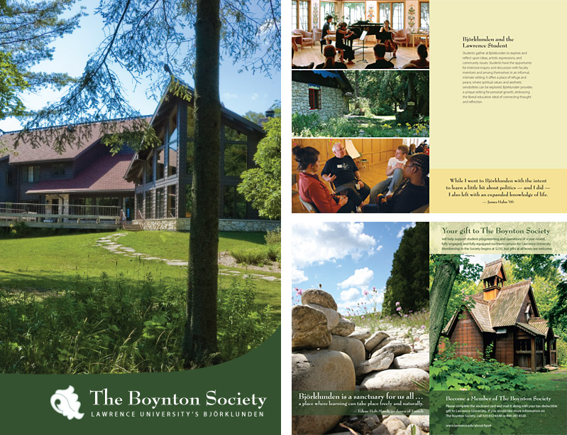
GOALS – Principle fundraising piece for the Boynton Society at Lawrence University
EXECUTION
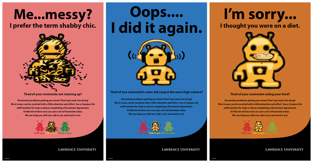 GOALS – Raise awareness for a "Roommate Agreement" initiative created by Campus Life to help students get along with each other in the dorms.
EXECUTION
EVALUATION – The posters were a big hit with students, and suceeded in raising awareness of the Campus Life initiative for dorm roommates. 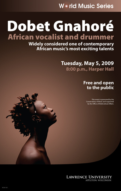
GOALS – Promote a World Music Series concert to Lawrence University and the community
EXECUTION
EVALUATION – The poster raised awareness of the event, and the client was very pleased with the design. 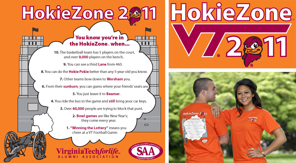
GOALS – The Alumni Association works with SAA students each year to create a HokieZone T-shirt. The T-shirts are sold through the Bookstore.
EXECUTION
EVALUATION – Everyone was very pleased with the final design and sales were strong. 
GOALS – The Alumni Association logo was in dire need of a revision that would make it clean, elegant, modern, scalable, and easily reproduced.
EXECUTION
EVALUATION – We've had the logo in place since April 2011. The new logo has removed all the issues we had with printing the old logo. I also think the quality of the design elevates the image of the Alumni Association. The simplified logo resulted in easily iterating the logo so that we have a reverse version and a vertical version. For extremely small printing, we have a version without the clock tower art. Eyetracking Web Usability is a fascinating book by usability experts Jakob Nielsen and Kara Pernice. It's an easy read chock-full of illustrations, great information and tips for improving websites. After introductory chapters that thoroughly explain eyetracking and the methodology behind the study that became the basis for the book, the authors explore the topics of page layout, navigation, web design elements, images, advertisements and user viewing behavior on the web. Here's just a very small sampling:
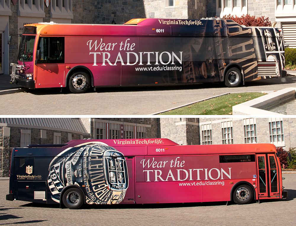
GOALS – The Ring Bus was designed to market the class ring program at Virginia Tech. We were looking for a creative and distinct way to market the program to students and raise awareness of the program to the wider university and local community.
EXECUTION
EVALUATION We saw an increase in web traffic to the class ring site this fall. The bus wrap was featured in VT News, and in the VT Magazine. |
Archives
September 2012
Categories |
 RSS Feed