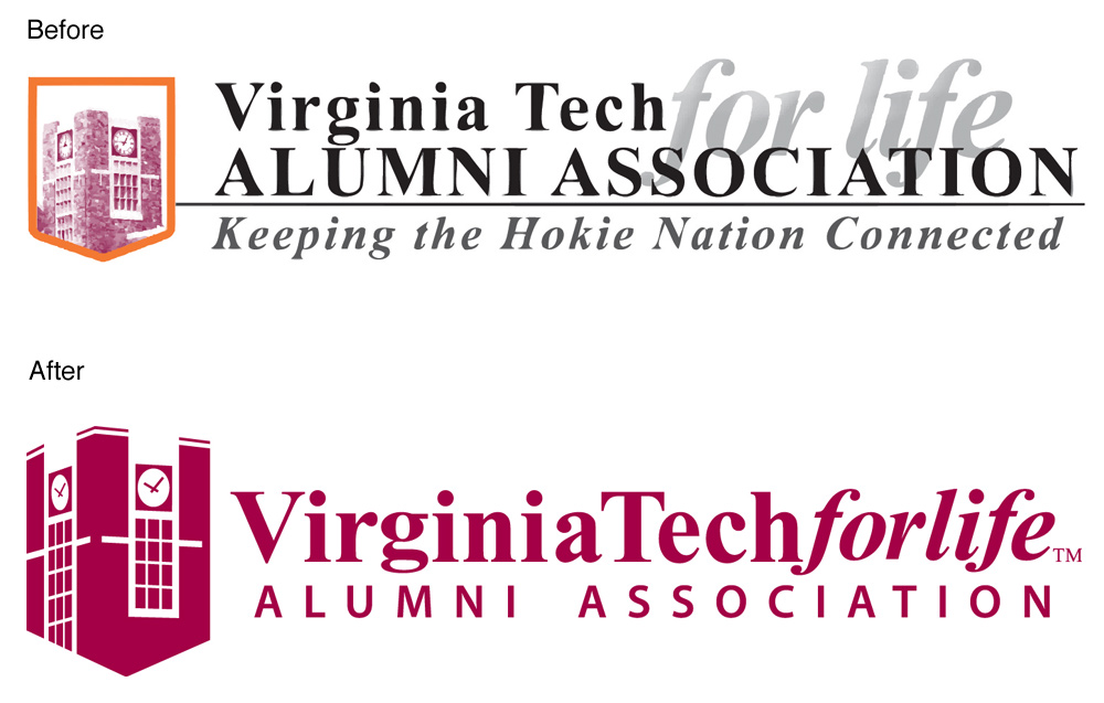
GOALS – The Alumni Association logo was in dire need of a revision that would make it clean, elegant, modern, scalable, and easily reproduced.
EXECUTION
EVALUATION – We've had the logo in place since April 2011. The new logo has removed all the issues we had with printing the old logo. I also think the quality of the design elevates the image of the Alumni Association. The simplified logo resulted in easily iterating the logo so that we have a reverse version and a vertical version. For extremely small printing, we have a version without the clock tower art.
0 Comments
Your comment will be posted after it is approved.
Leave a Reply. |
Archives
September 2012
Categories |
 RSS Feed