Dave Hunt

  • Home
  • Design Portfolio
  • Writing samples
  • Resumé
  • Contact
  • Home
  • Design Portfolio
  • Writing samples
  • Resumé
  • Contact

DESIGN DOCTOR: A BAD CASE OF DROP SHADOW

6/23/2012

0 Comments

 
Picture
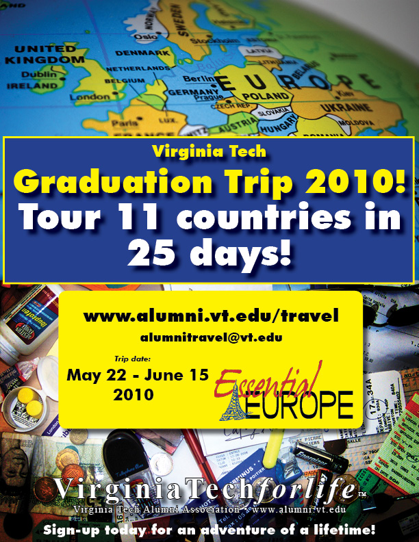
There are a number of issues with this design - the color scheme is harsh, the spacing inside that yellow text box is odd, and the text at the bottom is difficult to read on a busy background, despite the inclusion of an outline on the text and copious drop shadows everywhere. I address all these concerns in the redesign, but for this post I'm going to focus on those drop shadows.

I've been doing print design long enough to remember the days when there was some work involved to add a drop shadow to an element. One of the nice things about modern design software is how easy it is to apply effects like drop shadows on the fly. But to paraphrase Jurassic Park, novice designers may be so infatuated with what they can do that they don't think about or learn what they should do.

Let's start from the top of the design and look at the three drop shadows applied.

  1. The drop shadow on the large yellow and white text at the top is way to big, but it's also completely unnecessary. There's already sufficient contrast between the bright letters and the dark blue background, so the drop shadow doesn't improve readability. In fact, it might even be making that text more difficult to read. If a text effect has a neutral or negative impact on readability, the design is stronger without the effect.
  2. On the yellow sticker area, we see a better application of the drop shadow effect. The drop shadow is subtle, adds depth to the design and helps it stand out better against a busy background.
  3. The text below it, however, does have problems. The drop shadow is so large that it's getting away from the text it should be helping make more readable. On the small text below, the shadow is just a dark messy blur under the text.
Let's take a look at the redesign:
Picture
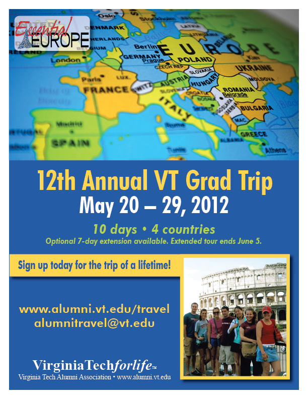
There's now only a drop shadow on the top left logo so it stands out better from the busy background below it, and a drop shadow on the text box and image to give a little depth. Spacing and font weights have been adjusted, the busy background image has been replaced with a solid background and an image of people enjoying a previous trip, which is stronger than generic clip art. I also modified the color scheme. I let the globe image set the color palette - the blue, warm yellow, and light green are all pulled from that image, so the colors are bright and bold, but harmonious and softened from the original.
0 Comments

DESIGNING A SERIES

6/16/2012

0 Comments

 
Picture
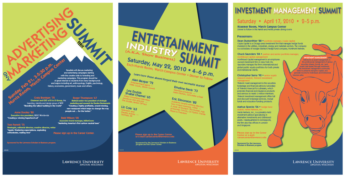
I've had a few opportunities to design a series like the poster set above, which was for Scholars in Business events at Lawrence University. No matter how you approach it, a series can have an intimidation factor because you're looking at multiple pieces that need to tie together, but the individual pieces need to stand on their own.

The client used words like, "modern, fresh, and bold" to describe the color palette and design they were after. Other than that, I was given freedom to come up with my own concepts. There were, however, two concerns. For each poster I was given a large amount of text and a small amount of turnaround time.

The poster on the left was the first I designed for this series. The word "summit" in the event title instantly brought to mind a mountain peak. I had fun putting this one together because it was an opportunity to do a little visual riffing on the old TWA destination posters I love. The second poster's tie-in to entertainment made a big star an easy choice, though it was challenging to get the text to play nice in that space. The third poster had a fun, large graphic element, though I do wish the client had been willing to cut some text.

A couple closing tips:

  1. Make sure client and designer understand vague words like "bold" to mean the same thing. On first proof, the sky behind the mountain was blue, and the client said, "It looks great, but we want bolder!" Swapping in a bold green was all it took for the client to fall in love with the design, and also helped establish a strong palette for the series.
  2. Don't paint yourself into a corner. Posters in this series were designed one at a time over the course of several months, with usually less than a week of turnaround time for each poster. I've worked on other series where every job came in on the front end and elaborate designs were feasible, but in this case, tight turnaround time mandated bold, simple elements. That's my design aesthetic, but it may not be yours. Either way, try to consider the series as a whole when designing that first piece, even if the following pieces are weeks or months away.
0 Comments

BOYNTON SOCIETY BROCHURE

6/2/2012

0 Comments

 
Picture
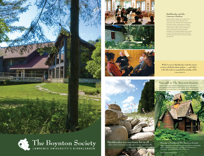
GOALS – Principle fundraising piece for the Boynton Society at Lawrence University

EXECUTION
  1. Conceptualization 
    The Boynton Society asked us to create a brochure for their fundraising campaign. I was assigned this project by the Art Director. 
  2. Schedule 
    Timeframe for this project was around one month. 
  3. Design and Tools
    This is an original design created by me. Photoshop was used for the images and InDesign was used for the layout. 
  4. Creativity 
    The brochure was designed to be light on copy and big on hero shots of Bjorklunden, an area in northern Wisconsin owned by the university. I was very happy with how I was able to make sure the text elements had a lot of room to breathe and how the text complimented and explained the photos while not distracting from them.
  5. Specs/Printing/Budget 
    Printed 4-color on a glossy text 60#. The requesting department had associated costs for this piece come out of their budget.
  6. Distribution 
    Copies were delivered to the client. Print services also mailed the brochure out on their behalf.  
EVALUATION – Client was very happy with the design, and the brochure became part of a successful fundraising campaign.

0 Comments

    Archives

    September 2012
    June 2012
    May 2012
    April 2012

    Categories

    All
    Branding
    Design
    Web

    RSS Feed

Copyright Dave Hunt 2020