Dave Hunt

  • Home
  • Design Portfolio
  • Writing samples
  • Resumé
  • Contact
  • Home
  • Design Portfolio
  • Writing samples
  • Resumé
  • Contact

ATHLETICS IDENTITY

5/26/2012

0 Comments

 
Picture
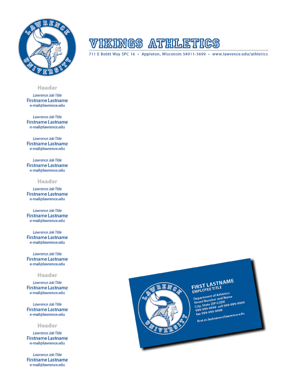
GOALS – Create new letterhead and business card identity pieces for athletics department

EXECUTION 
  1. Conceptualization 
    The athletics department asked us to help them create letterhead and business cards. I was assigned the project by the Art Director. 
  2. Schedule
    The timeframe for this project was around a month due to the impact it would have on athletics department materials.
  3. Design and Tools
    This is an original design created by me. Part of this project included creating a clean vector image of the Viking, which is something the athletics department didn't previously have. The art was created in Illustrator, the letterhead and card were created in InDesign.
  4. Creativity 
    I think the design relfects my aesthetic, and I was very happy to create vector art that would be much easier for the athletics department to resize as needed on other projects.
  5. Specs/Printing/Budget/Distribution
    Letterhead stock was bright white #40 and on the press. The business cards were printed on white card stock, 10-up, on a color copier, then trimmed in print services. Cost was covered by the athletic department, with final pieces delivered to their office. 

EVALUATION – The athletics department began to use the communications department more frequently for their design jobs while I was at Lawrence. I was very happy for the opportunity to help them create these identity pieces. These elements were used again through other pieces for that department. 
0 Comments

ROMEO AND JULIET POSTER

5/19/2012

0 Comments

 
Picture
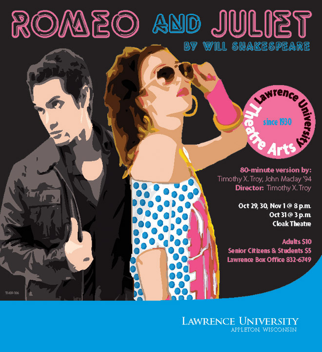
GOALS – Promote the theatre department's production of Romeo and Juliet

EXECUTION
  1. Conceptualization
    The Theatre Department asked us to create a poster design to help promote their production of Romeo and Juliet. The project was assigned to me by the Art Director. I became the default designer to work on theatre department job requests. 
  2. Schedule 
    We had a few weeks to work on the poster.
  3. Design 
    This in an original design by me. The two people began as stock art photos.
  4. Tools 
    Photoshop and Illustrator were used to create the people, sort out colors, add polka dots to Juliet's shirt, etc. The poster was created in Indesign. 
  5. Creativity 
    Some of my favorite jobs during my time at Lawrence were those working with the theatre department and collaborating with the theatre director. (You can see a number of these designs in my porftolio.) He would give thoughts about the direction the staging was taking, mood, colors, costuming, and any influences, and then I would come up with a concept based on our discussion. For this particular poster, he described the production along these lines: "Romeo and Juliet, set in the 80s, on the Jersey Shore. Neon signs. Romeo is James Dean meets young Springsteen. Juliet is an 80s girl pop princess." I sent this design to him and asked if it was on the right track. He responded, "You so totally get it! I love your work. This is great." 
  6. Specs/Printing/Distribution
    80# matte with bleeds, printed in-house with campus printing services, distributed on campus and throughout the community. A larger format (approx 3 ft x 4 ft) version was also created for each production to hang in the theatre department near the ticket office. Posters were paid for by the theatre department.
EVALUATION – My first goal with these posters was always to do my best to create a design true to the vision of the production's director, with the ultimate goal being to of course drive ticket sales for the performance. This design achieved those goals.

0 Comments

BRANDING: BRIEF THOUGHTS ON WHY IT MATTERS

5/16/2012

0 Comments

 
Some have distilled branding down to simply meaning a good name, but if it were that simple, there wouldn't be dozens of books written about the subject. Creative Strategy in Advertising defines a brand's identity as "its strategically planned and purposeful presentation of itself to gain a positive image in the minds of the public." This means that while branding does involve the obvious visual identifiers that immediately come to mind - things like logos, wordmarks, color palettes, etc. - branding is also about perception and reputation.

But why does this matter?

I spent the majority of 2009 working on a research project involving social media and politics. During that time, I discovered the work of professor and social scientist Margaret Scammell, who has written extensively about branding and marketing as it pertains to the realm of political science. The following points summarize her conclusions on why branding matters:

1. Branding is imbued with intrinsic financial value.

2. Branding has the power to transcend audience fragmentation and succeed where traditional mass advertising is ineffective due to the glut of advertising in modern society.

3. Branding is a two-way conversation where customer engagement helps shape the brand.

4. Branding is an asset to the brand holder due to the protection the brand offers against more demanding consumers and, through successful emotional engagement, the brand drives repeat business and return sales.

You can probably imagine how these concepts apply to political science (and regardless of your politics, it's worth examining the 2008 Obama campaign's use of branding, another topic I've put some time into researching). These attributes also point to why branding is such a popular concept in marketing circles. Achieving financial success, rising above the information glut, engaging consumers, building a strong reputation, and creating repeat business - these are obviously great goals.

And yes, your journey on the branding path might start by thinking about names, logos and colors (and hopefully copy - don't underestimate the power of good wordsmiths!), but true branding success doesn't come without thinking carefully about bigger issues. For example, how will you interact with your audience, and how will you manage those interactions? Just having a Twitter account and a Facebook page aren't, in and of themselves, enough to guarantee success. But that's a topic for another day.
0 Comments

DORM POSTER SERIES

5/12/2012

0 Comments

 
Picture
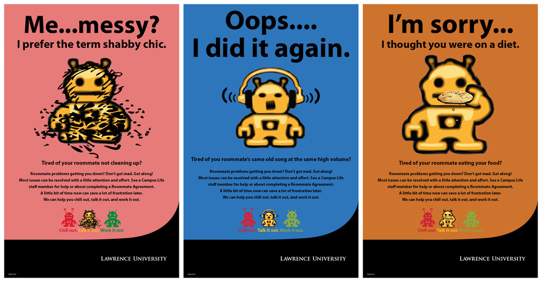
GOALS – Raise awareness for a "Roommate Agreement" initiative created by Campus Life to help students get along with each other in the dorms.

EXECUTION

  1. Conceptualization
    Campus Life requested the poster series. They provided text. Project was assigned to me by Art Director.
  2. Schedule
    We had a couple weeks of turnaround time on the posters.
  3. Design 
    The robot originated as a clipart image. I created a vector version in Illustrator, then modified him for the different posters and the three small versions on the bottom of the posters. 
  4. Tools 
    Photoshop and Illustrator were used for the art. Posters were created in InDesign. 
  5. Creativity 
    I've been fortunate to work on many projects that involve using my creativity, but few that include the opportunity for a little humor like this project did. I had a lot of fun playing with robots for a couple days. For the messy robot, I lifted the squiggles and dirt marks from a Charles Schultz illustration of the character Pig Pen. 
  6. Specs/Printing/Budget/Distribution
    Almost all posters at Lawrence like this were printed on 80# matte, tabloid, no bleeds. Posters were printed in-house with print services on a color copier, then distributed by our student interns. Print services was in my department, so press checks were often as simple as going down to the basement floor. I had access to print on the same color copier, so I was able to check color and printing errors before sending it to print services to run the full quantity. Departments on campus that requested the posters were billed a small charge for printing expenses.

EVALUATION – The posters were a big hit with students, and suceeded in raising awareness of the Campus Life initiative for dorm roommates.
0 Comments

WORLD MUSIC SERIES POSTER

5/5/2012

0 Comments

 
Picture
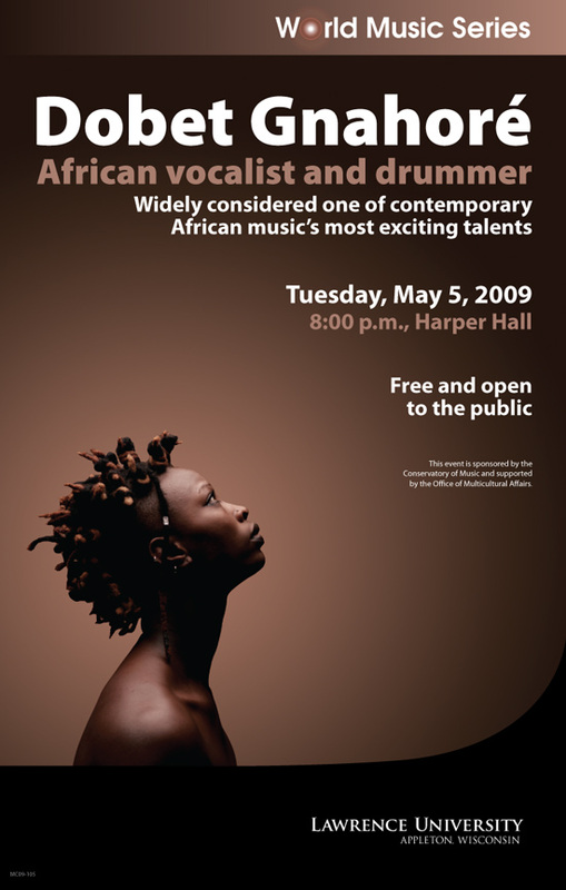
GOALS – Promote a World Music Series concert to Lawrence University and the community

EXECUTION

  1. Conceptualization 
    Project was assigned to me by the Art Director. I was given an image of the artist as a starting point.
  2. Schedule 
    I had a couple weeks to create the design, route it through the communications department, receive client feedback/approval, and send them to our print services staff to print. 
  3. Design 
    The design is an original one created by me.
  4. Design and Tools 
    I used Illustrator to create the World Music Series logo, which was then used for other concerts in the series. The original image had a similar background gradient radiating out from the artist, but the image only extended an inch or two beyond her head. I created a Photoshop image the size of the poster, created a mask around the artist, then reapplied the gradient so it filled the full space of the poster. 
  5. Creativity 
    I'm really happy with how the image and gradient turned out, and love that I was able to leave so much open space around her.
  6. Specs/Printing/Budget Distribution
    Posters like this at Lawrence were printed in-house in our print services area, which was part of the communications department at the university. Posters like this were typically printed on 80# matte on a color copier. Quantity varied, but was typically around 100. Student interns distributed posters around campus and the local community, in addition to supplying copies to the department that requested the poster. 

EVALUATION – The poster raised awareness of the event, and the client was very pleased with the design.

0 Comments

    Archives

    September 2012
    June 2012
    May 2012
    April 2012

    Categories

    All
    Branding
    Design
    Web

    RSS Feed

Copyright Dave Hunt 2020