|
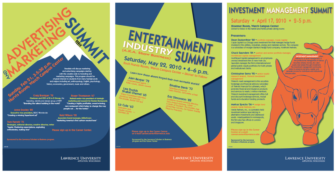
I've had a few opportunities to design a series like the poster set above, which was for Scholars in Business events at Lawrence University. No matter how you approach it, a series can have an intimidation factor because you're looking at multiple pieces that need to tie together, but the individual pieces need to stand on their own.
The client used words like, "modern, fresh, and bold" to describe the color palette and design they were after. Other than that, I was given freedom to come up with my own concepts. There were, however, two concerns. For each poster I was given a large amount of text and a small amount of turnaround time. The poster on the left was the first I designed for this series. The word "summit" in the event title instantly brought to mind a mountain peak. I had fun putting this one together because it was an opportunity to do a little visual riffing on the old TWA destination posters I love. The second poster's tie-in to entertainment made a big star an easy choice, though it was challenging to get the text to play nice in that space. The third poster had a fun, large graphic element, though I do wish the client had been willing to cut some text. A couple closing tips:
0 Comments
Your comment will be posted after it is approved.
Leave a Reply. |
Archives
September 2012
Categories |

 RSS Feed